- Aug 7, 2018
- 7,108
- 9,112
Correct.There's not, as of yet, much of a unifying philosophy that I can detect in terms of the usage of color in Future World.
Correct.There's not, as of yet, much of a unifying philosophy that I can detect in terms of the usage of color in Future World.
There's not, as of yet, much of a unifying philosophy that I can detect in terms of the usage of color in Future World.
I think once the Future World work is all wrapped up, things will be a lot more than presently. With so much being worked on, I’d at least hope that’s the case.
Really? I thought the opposite was going to be true with the redono biggie, just looked (to me) as if all the bright colors of the past are being replaced w/ dark/dull/industrial -- I just think someone watched too much Blade Runner or something, I know it is not a lot to go by, but the signage plus what has been painted thus far gave me an impression that future world is going colder/darker than the past. Then again, I just do not like colors using a flat gloss.
no biggie, just looked (to me) as if all the bright colors of the past are being replaced w/ dark/dull/industrial -- I just think someone watched too much Blade Runner or something, I know it is not a lot to go by, but the signage plus what has been painted thus far gave me an impression that future world is going colder/darker than the past. Then again, I just do not like colors using a flat gloss.

They're trying to blend in with, and match, the look of the Harmonious Barges. It's the new theme, "The Future is UGLY", to try to one up DinoRama UGLY in AK. The new Disney Normal.no biggie, just looked (to me) as if all the bright colors of the past are being replaced w/ dark/dull/industrial -- I just think someone watched too much Blade Runner or something, I know it is not a lot to go by, but the signage plus what has been painted thus far gave me an impression that future world is going colder/darker than the past. Then again, I just do not like colors using a flat gloss.

Really? I thought the opposite was going to be true with the redo
It seemed that way anyway from concepts
It seems based on recent interviews that specific colors will make their way back in, not sure if that'll translates to the buildingsI honesty have not kept up with things so I have not seen any concept art. This was just based on my going to Epcot for the first time in some 7 years. I felt the colors they used on the old Energy building are bland -- then the (looked flat to me) the white and black of that event/restaurant....bunch of construction walls in black.
But yes, the entrance is tons better w/o leave a legacy.
It seems based on recent interviews that specific colors will make their way back in, not sure if that'll translates to the buildings
As far as the Guardians building, I honestly have no clue what they're doing at this point haha
It seems to me they're being intentional about colors with new Epcot

All I remember is some guy holding up the color samples on a video about Epcot recently lolI think that is what I was picking up on. Someone is playing w/ colors along with whatever direction Epcot is taking these days.
View attachment 13685
All I remember is some guy holding up the color samples on a video about Epcot recently lol
I wish I could be more descriptive haha

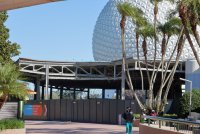
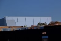
I'm honestly not sure what they're doing with that half of the old Communicore..I guess we'll seeno worries. I just found it -- well, I guess they got me wondering -- that's not a bad thing either (I mean I had been away from this park for a long time).
View attachment 13687
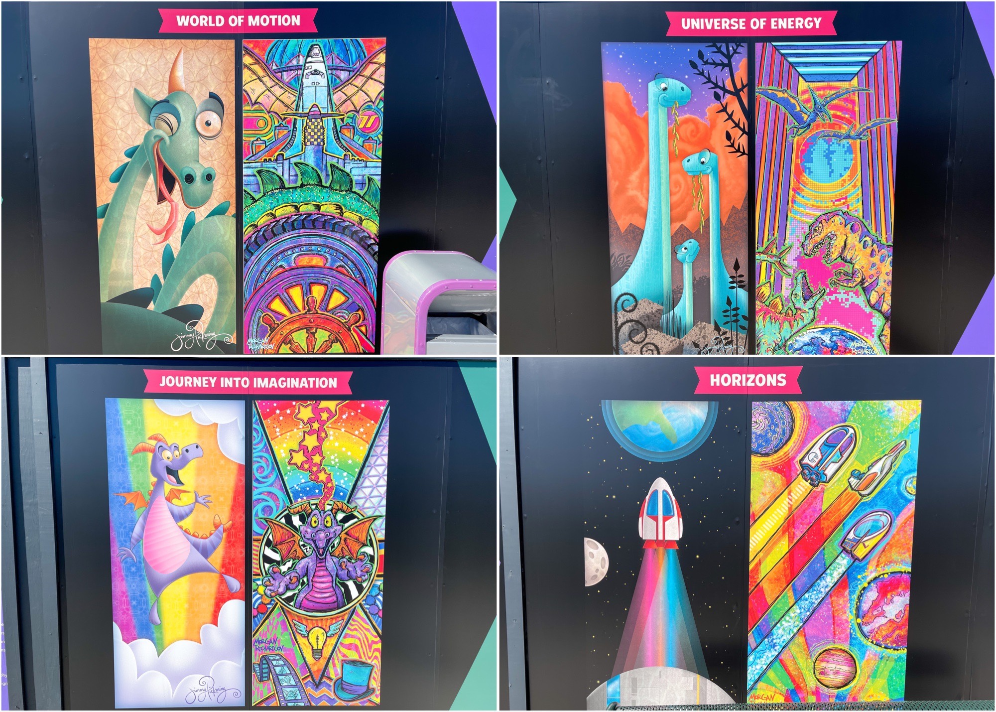
People just walk by this monument and forget all about how Micheal Eisner defeated that dragon right in that spot
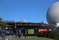
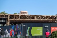
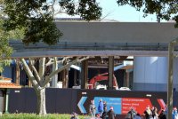
Thank you for reminding me about the Guardians building loltruly have not been in a WDW park in many years before this week. I'm not sure what is construction, what is deconstruction, but I do feel change was needed. So I'll just say here are a few pictures of progress.
Thank you for reminding me about the Guardians building lol
Tbh, for me, the Guardians building is most egregious from the parking lot. In Future World, there's actually no place you can see it. In World Showcase I hardly notice it either unless the angle is just right. We joke and all, but the sky blue color is way better than if they had chose a color that would've made it stick out more than it already does.dangit, why'd you point that out? I didn't even notice it the way it just blends in with the sky and all!
Tbh, for me, the Guardians building is most egregious from the parking lot. In Future World, there's actually no place you can see it. In World Showcase I hardly notice it either unless the angle is just right. We joke and all, but the sky blue color is way better than if they had chose a color that would've made it stick out more than it already does.