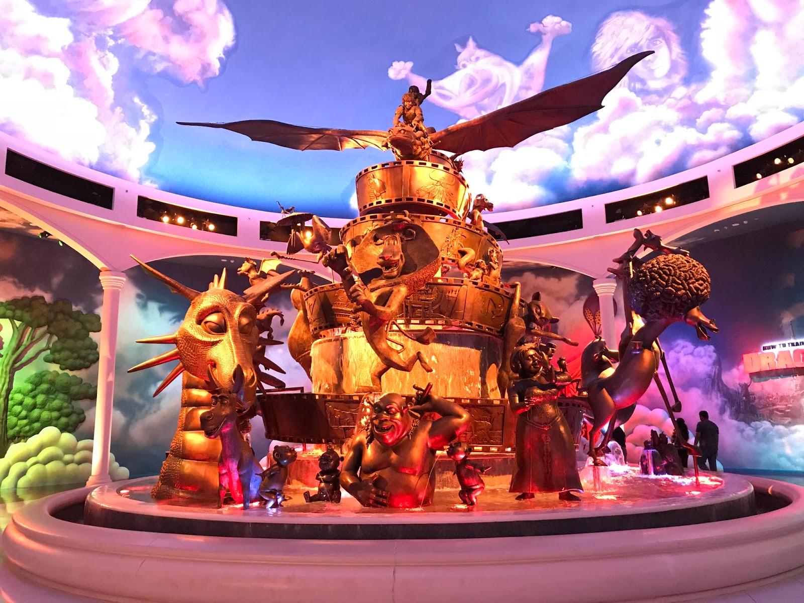
Looking at it again, it's the completely unnecessary white/blank space outlining or between some (but not all) of the characters. If they cut the twee signs and eliminated this white space, I think it'd look a lot better. Right now, it looks like an unfinished art file that didn't get exported correctly.
I think if they redid the back part to ditch the signs and made the DreamWorks moon/silhouette a little thicker and layered (allowing a nice glow effect at night), it would probably be received a lot better.