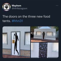
Eh. I'm not a fan of the "it's cheap because it's supposed to look cheap" thematic justification. You can make them look like trick or treating spots without the generic warped graphics that look like they were put together in Microsoft paint.
To be clear, I think a lot of the graphics - particularly some of the house and zone logos - look really cool. But there's definitely a few with a noticeable drop-off in quality. I imagine they maybe lost some talent during the pandemic purge, which we are only starting to see/feel this year.